Websites that I like

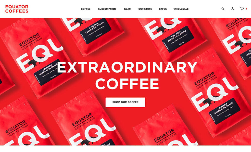
I am a coffee lover, and one of my favourite brands is the Equator. On their website, they have the slogan “Coffee can be better roasted, better prepared and, most importantly, it can be obtained in a way that improves life”, they explain the founders of this e-commerce, created in 1995. Its web design stands out for a successful combination of fonts and colours and the originality of the presentation of its products on the home page (below the initial slider) it is a simple parallax effect, but effective, accompanied by animations in the titles and other quality indicators, which do not weigh download times.

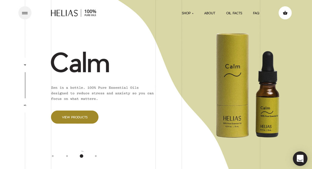
The Helias Oils company has one web page that has stood out for its most groundbreaking design in recent years. In this e-commerce, dedicated to the manufacture and sale of essential oils and homoeopathic remedies with 100% natural ingredients, we find (once again) the sequential structure, similar to some slides: a touch of scrolling is enough to navigate between its pages, designed with a background in white and pink, white and green, etc., with ripples similar to a liquid. Its minimalist aesthetic is surprising with the presence of transitions with a liquid effect between pages.

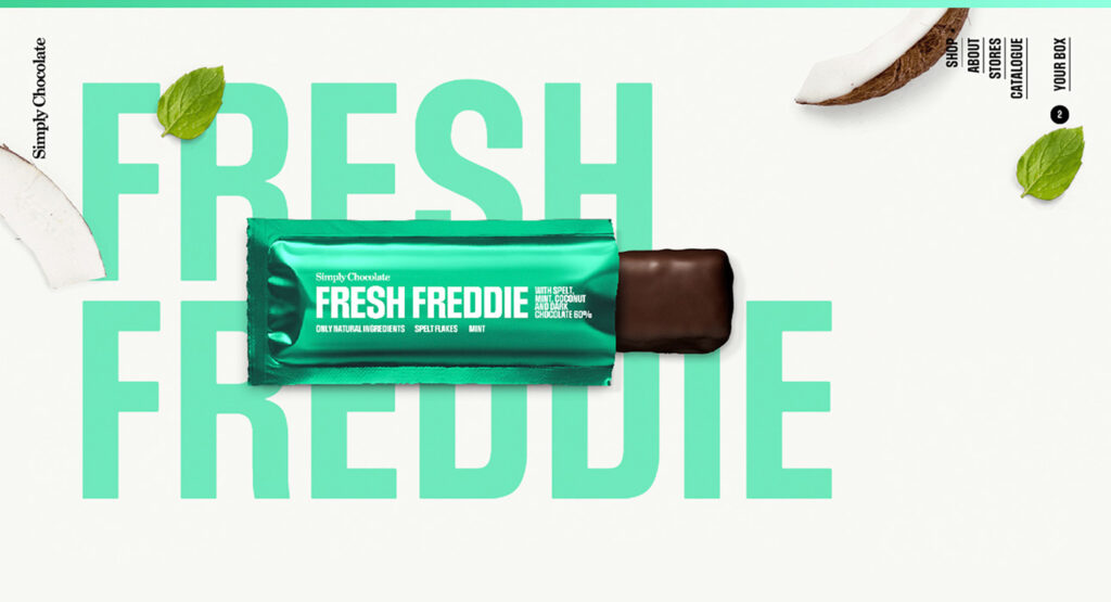
Simply Chocolate store boasts one of the best website designs. This Danish producer of chocolates makes his products by hand with natural ingredients, and his web space underlines that homemade ‘touch’ by showing his chocolates against backgrounds with leaves, sect fruits or fruit slices. Your web design can be defined as sequential (a touch of scrolling makes the vertical sections go through like slides), using the same background colors that correspond to your chocolate bars: brown, blue, green, etc.