June 15th, 2023
Amigatalk.com
During the evolution of this project, there have been different changes from sistalk.com to amigastalk.com. Amiga Talk web page is designed to help young Colombians to analyse their emotions. On this web page, emotions will be divided into 18 emotions. These emotions are positive, negative and neutral.One of the most critical problems is how the user will interact with the web page since it is a card game.
During the presentation of the prototype, several suggestions for changes occurred.
1. One of them is adding Spanish as an option to the website since it is designed for young women from Colombia. For the English part, it is recommended to have a review of the information since when it is translated, it can generate errors. Use any WP plugins.
2. Another recommendation is to seek a psychologist’s help with the content-created information on the website.
3. For the face icons is better to create a scale instead (still involving the
faces as anchor points on the scale) to have a broader range of emotions to present “How are you feeling today” Only three options oversimplify what you are trying to do, and the icons may trivialise the feelings.
Other changes come from the design part.
1. Change the background colour (D1C9B5) is a little too dark and would work even better if it were a bit lighter.
2. The illustrations are dark is better to use lighter shades of grey especially for the figure, and for clothes, you could use that lovely Rosé shade as a colour accent.
3. Change typography to Noto Sans.
I suggested this to them as they must accommodate various languages with special characters, such as Spanish.
Posted in Richardson’s traditional bakery | No Comments »
April 13th, 2023
There is six basic emotions: happiness, fear, sadness, anger, surprise and disgust. But the brain is much more complex, and we can feel many more emotions. A study published in PNAS was carried out in the United States, in which they questioned whether humans were only capable of experiencing six emotions. The work showed that 27 emotions could actually be differentiated. By connecting and interconnecting with each other, it can form 270 emotions with which human beings are capable of expressing and relating.
For this project, we will work with these 27 emotions, but we will carry out a study analyzing which of these emotions are most important for young Colombians. This study will be conducted in Spanish and show the different emotions divided into positive, negative and neutral. The idea is to select the most marked feelings to analyze them and be able to develop them during this project.
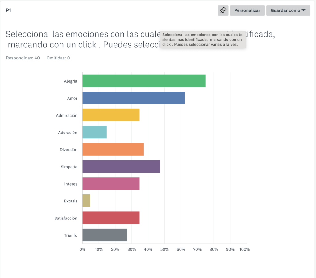
After conducting the survey and dividing the feelings into both positive and negative, and neutral, asking more than 50 young adults from Colombia. I have obtained the results that I will use for my web page since creating 27 emotions is beyond my possibilities. Perhaps I will develop the project with much more content in the future.

The activity asked is to select the emotions you feel most identified daily. In other words, highlight the feelings that you most often feel. Within the table of emotions, the least selected are a triumph, adoration and ecstasy.

With the same dynamics as the previous question, the second question deals with more neutral emotions. Again, the least users select are anxiety, astonishment, and carnal desire. The last one surprises me that it is one of the least favoured; perhaps it is because people feel ashamed of choosing it, or it may simply be that the research group is not interested or feels uncomfortable talking about the subject.

Finally, we have the negative emotions in which people have decided that the ones they feel the least are envy, horror, and shame. Envy surprises me the most in these negative emotions since, as with carnal desire, not everyone feels comfortable selecting it, so I am unsure about the result. Likewise, shame is a complex emotion because not everyone feels shame similarly. In conclusion, this test helped me select the emotions for my web page with an investigation behind it because of my decisions based on my search for information.
Posted in Major Project, Richardson’s traditional bakery | No Comments »
April 11th, 2023
During the project, the name changed due to several factors, one of which is that the initial title was already used for other web pages. So, in the second stage, I decided to use the name hermanatalk.com. This is because Hermanass means sisters in Spanish, and talk is to speak in English. But after the review, it was concluded that the name could be complicated to read and write and that it is too long.
In the design context, we will follow a line of inspiration based on Japanese tea houses since everything is related to an oriental theme, including the pinky promise logo. The illustrations also have a manga drawing style, thus creating a solid attachment to the website’s branding. One of the first impressions that we want to offer the user is to be able to relax when entering the web page, at first I thought of using a handwritten font; the problem with this type of font is that they are challenging to read, and They can come across as unprofessional. one of the proposals for this project is not to cross the line between the girlish and the feminine.
Finally, it has been decided that the last name is amigatalk.com. Amiga means friend. It is available on Google, and it is also a good name because it mixes Spanish with English; it is not so extensive or difficult to remember and very consistent with the main theme page of the website.
In conclusion, amigatalk.com is a web page created to use as a tool for adolescents in Colombia to guide them about their emotions and those mood states that are difficult to decipher.
Can we help to identify emotions in young Colombian women?
Posted in Richardson’s traditional bakery | No Comments »
February 28th, 2023
The first draft concept for the master project was to create a web page with the different moods of adolescents. This project was born from a conversation I had with the youngest woman in my family since they had problems understanding human beings’ different emotions. Big Sis was born is a website that acts as a helpful tool simulating the advice of an older sister as an introspection tool.
Narrow
I repeatedly acted during the project’s first steps, narrowing and redefining the concept for a target audience.The culture and how we have been raised influence our personality and our way of seeing the environment that surrounds us. For this reason, one of the first problems I had to solve was defining the target audience.In the first stage, we defined that the public would be designed only for South America, but this would also include Brazil, and we would have to add a new language, Portuguese.
In the second stage, I decided to focus on my country of origin, Colombia. I concluded because I would like to include alternative information about other psychology or professional help web pages.
Previously the website was going to be designed for all genres. But the different genres interpret emotions differently, and the content would not be so defined, so I decided it would be for young women from Colombia between the ages of 15 and 23. Although the problems and perspectives are different in that age range, many things in common are shared and repeated over the years.
Why Colombia and not another place?
I chose Colombia since, during this process, it would be much easier for me to develop the website based on my own experience and also due to other factors, for example.
A cultural factor in Colombia, mental health is a taboo subject. The general mentality is the belief that only people who suffer from madness or disorders go to a psychologist. Another significant factor is that a high percentage of the population does not have access to psychological help due to the high cost of living and the low salary, in addition to the increase in suicides in minors concerning mental health and bullying has increased considerably, creating a Social problem among Colombian youth.
Target Audience, working with the user experience.
One of the points I must define is whether I will include parents and friends in the interaction with the website since one of my great fears has to change the content to adapt it to each of these factors. The main problem is that the content would take me a long time. Since I don’t have experience raising a young woman, I don’t know if I could have the ability to give a clear perspective to a father or a mother, in addition to the fact that they would have to broaden the user experience. To accommodate these changes.
In addition, the user journey would be very complicated, the user experience could fail, and it would no longer be a web page for young women if parents or friends were included. The main idea is a woman talking to another woman. And one of my fears is that if it includes parents, adolescents may feel self-conscious and not want to use or reject the website.
We will keep the
how do you feel today? Instead of How is she feeling today?
One of the concepts we must be clear about is that this website is a page for personal introspection and guidance so that young Colombian women can help with their mental health and emotions. If the user has more severe problems she cannot solve using this tool, she will be provided with additional information to find professional help. Big sis is a website to help adolescent women identify their emotions and how to deal with them.
Posted in Major Project | No Comments »
April 1st, 2022
In this article, we will explore the process of revisiting the small business website with all the changes and improvements. During this journey, the gain of knowledge is considerable. Therefore, we will divide the steps.
- SEO features
- Mobile-first
- Javascript
- PHP
- UX features
- Accessibility features
- Review Change
SEO features
To improve the SEO of our site, we use metatags and microformats.
Meta tags help search engines interpret the content of a website. Consequently, it is essential to make them readable for search engines and potential customers.
In the image below, we can see the use of different Meta tags that I applied to the HTML document. The use of h1 is essential to improve the SEO of the website. These improvement actions will be beneficial for the bakery website.
On the meta tags description, I expose the brand’s beliefs that is Richardson’s traditional bakery local products for local people and the three main words that describe the business Tastier, easy to digest and more nutritious. The main reason for doing this is because we want our customers to associate us with our brand values. Having strong branding is essential to having a better SEO. It Helps the website to have a unique touch and make a difference from other standards websites.

Another element to improve SEO is microformats. I used the h card; this microformat helped display your information in the search engines, for example, google. In this case, if someone is looking for a bakery around the area, the microformat will help us highlight our information and display our data on google search. This action is beneficial because we can attract more customers to our service. In this generation, we use the phone to research everything on the web. That’s why it is essential to improve our findability to reach a bigger audience

Mobile-first
In this project, we have the challenge of creating a new website version friendly to use with a mobile phone, which means that the website should be able to work on different screens sizes. To do this, we need to use the media queries to adapt our content in various sizes without squeezing the images or losing quality pixelation. At the same time, we need to work with the meta tag viewport to be able to see it on our screen.
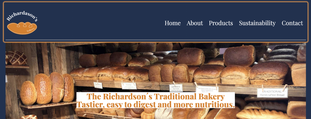
I have to adapt each page for the revisited website because the content and the grid are different. However, we have common elements, for example, the footer and the navigation, that are the same on each page and subpage.

Javascript
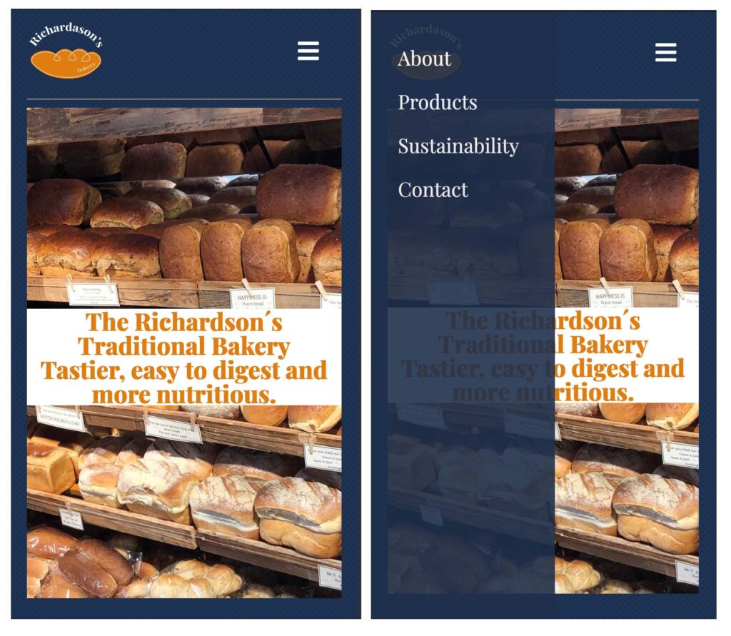
One of the requirements for the revisited website was to include some basic javascript in our webpage. For this exercise, I decided to do phone navigation when the website’s screen is small in size. The main reason for doing this is because the user experience is essential for our webpage and business. If we have a functional navigation menu, it will be easy for our customers to reach the information they are looking for. Therefore the menu and the navigation increase in size with the functionality of seeing the display more extensive. Our target audience is local people from a small town in England. In this case scenario, the population of a small village are older adults. That is why the grid design is straightforward, and I prioritize seeing the elements clearly on the mobile size screen.
PHP
Learning PHP server-side includes is one of the subjects in web design that will help organise our content and modify any element. In this case, the website consists of the main page and four subpages. At the moment, the bakery website is a small site with low content, but in the future can be a more significant size with more data. If we tried to modify each page by page, it would take us a considerable amount of time.
PHP is a fast and clever way to organise your content without investing that much time. In HTML, we have elements in common in all our pages, for example, the header, the menu navigation and the footer. Therefore, in the revisited business website, the header is different on the main site than in the subpages, but the menu navigation and the footer are the same. Using PHP, I can have access to change or modify all the pages and subpages simultaneously.

Ux features
We included two elements to develop a better user experience in this project. One is the favicon icon, which is the website logo included inside the tab. For this icon, we worked on the size because it must be weight light for better performance on the web.
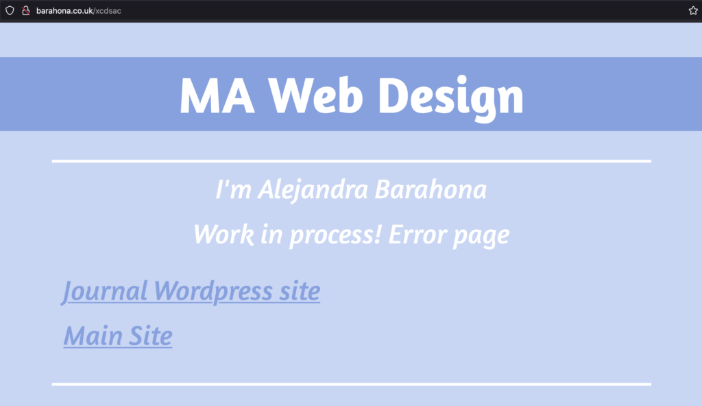
The other element is customised error pages. This improves the user experience because even if it is an error page, it connects with the visual design of the leading site. At the same time, we can add some links to help the user come back to the main page. We do this because we don’t want the user to get lost on the web and frustrated.

Accessibility features
There are different tools that people can use to read the screen, for example, the chrome reader extension. This app helps people with disabilities, blind or eyesight people, to be able to interact with the website.
For this project, we need to make the website visible to read, so we need to integrate different elements in our HTML for the user elements, such as landmark Roles. During this process, I discover that a good description of the images is beneficial for the user to visualize what they are hearing.
These small steps make it more significantly different for someone who has a disability to interact with the web. In my case, this is one of the hardest things to develop for the revisited website because I couldn’t be tried with someone with disabilities. Also, knowing if I was doing things right is complicated when you can not taste them properly.

Review Change
After reviewing the small business website, I make some changes to improve the project.
- Grids, on the previous website, I didn’t display a proper grid system to organise my content.
- The size of the images I change the size for a lightweight website will help optimise and improve the service, which means that the website will be faster.
- The use of figure elements for image/caption
- Make sure that I have a font stack for fallback.
- Don’t overuse the italic for big pieces of information because it is harder to read.
- Simplify my code and make it short and easy to read * I tried.
- Change the placement of the logo to be more suitable.
- Always check your code.
Conclusion
This project was a challenge, but I learned so much that I can see the massive difference between the websites. This project helped me develop a better understanding of the web and how things work and make me more curious about how can improve. These are baby steps in the process, but I am learning the different aspects of the web step by step.
Posted in Richardson’s traditional bakery | No Comments »
March 11th, 2022
In this article, we will learn about microformats and their impact. We will define the different types of microformats and what their functions are. We will also discuss the benefits and cons of using microformats on your website.One of the first steps to understand what microforms are would be, to begin with, the definition. Erick Mcgehearty defines Microformats are a part of HTML markup. It’s an extended markup. It is additional metadata that can be added to some content on your website. You can put microformat tags around certain content on your website, such as
• Dates, times and places of events
• Contact information such as the address and phone
number of your business.
When we read complex definitions, in some cases, we do not understand their meaning, especially if we are not familiar with the context. In this case, when we speak about microformats, there are technical words such as metadata. But what is metadata? The easy explanation is that the metadata is data that describes other data. We can define microformats as elements that help us organise our information to clarify our code to be easier to read for the machine and an external person developing a better performance of our website.

One of the examples that we can identify based on real-life is that years ago, to see the times of a movie in the cinema or the rating comments. You should access different websites and choose which schedule is better and which cinema you have more near your location. These days, this problem is solved with a simple google search. We can access the schedules, the rating of the movie and which is the closest cinema in our research with one click away. This is due to the use of microformats.
Following the next steps, we need to talk about the history of microformats and why they were created. Microformats are an element intended to bring order to the web. At the end of the decade of the 90s, a tendency began to appear to separate the structure from the content, that is, the structure of the HTML and the CSS. The main problem is that when a machine enters a web page, it does not know the difference between the personal data of a simple text. But, on the other hand, a human being can observe the difference in the code. The people in charge of working on W3C have the objective of designing a semantic web; microformats is an intermediate step towards that semantic web. Furthermore, microformats are open and decentralised and are available to everyone.
At present, these elements serve to make it easier for you to be found on search engines such as Google. For example, suppose you want to search for information on where to eat sushi near you in London. In this case, microformats are great to help access data more straightforwardly on Google. Faster and easier. WordPress automatically includes microformats in your web pages when creating a website with them.

The next step we need to take is to talk about the advantages and disadvantages of microformats. This element has both negative and positive things when we use it on our web pages.
Advantages
- Google is becoming more time-sensitive, real-time search. This means that microformats effectively give more information to Google, improving your search listing in less time. They make sharing and reusing information more accessible across different applications and websites. In addition, it makes it easier for Google to extract the information already on the page. For example, if you have your address on your website, the microformats will tell Google precisely what it is, and its meaning.
- Ultimately microformats allow more interaction between your website, other websites, and different applications.
- Make it easier for others to understand and reuse the extra information about your content. With the microformats, your data is easy to use and more readable. The difference between plain text and your personal information is more apparent, for example, with the microformat Hcard.
- Improving the semantic value of your content means that your code is more accessible for the web browser, and it’s creating an optimisation website. Understanding the semantic meaning of microformats allows the document outline to be structured in detail. This helps the reader to visualise better and understand the content.
- Webspiders like Googlebot make use of them in site indexing.
Kramer Caswell, in his article, Do microformats help my SEO? Explains that Googlebot now has more information to crawl on with the introduction of microformats and schema markups. Your microformats can introduce more content and provide data on the description of the article, who wrote the article, who published the report, the website URL and more – thus producing more value to a Google user, which is the main search criteria for the Googlebot. That means that the article is best structured and most straightforward.
- Compatible with most commonly used web browsers such as Safari, Chrome, Firefox, Edge, Internet Explorer, Opera, We can use microformats in most web browsers with any inconvenience that helps the user find information more accessible.
We know that microformats are beneficial for web pages, but we must also know the disadvantages. Then we will talk about why using microformats can be harmful in different aspects.
- Microformats are dependent rather than standalone format. To use a microformat, XHTML must also be supported in the host document. The microformats are compatible with the XHTML language, this system is needed so that the microformats can be read by the machine and thus develop their qualities, that is to say, that the microformats are not a new language, they take advantage of the labels and standard XHTML attributes for assigning semantic information to portions of code.
- Verbose
Using the same format for human and machine consumption, services may become much more bandwidth-intensive. This means that your code will probably become longer and take up more space in your code reader. Sometimes, if we abuse these elements, it is more difficult for the server to read.
- Harvestable
Microformats are open conventions that seek to apply semantic value to XHTML content.
Risk of codified content being successfully harvested for less than desirable purposes.
Concern for the abuse of hCard for spamming purposes is of particular concern. All the information that we place on our website will be easily sortable and understandable by all those who come to our website, whether they are people or search engine robots that analyse the content of our pages. However, this is a double-edged sword because all that information is available to third parties who may have bad intentions with our personal information.

When we talk about microformats, we must also talk about SEO. What is SEO? According to the website, moz.com SEO stands for search engine optimisation, a set of practices designed to improve the appearance and positioning of web pages in organic search results. In other words, it is the process of enhancing your site to increase its visibility when people search for your products or services. Microformats have an essential connection with SEO for two main reasons: the user experience and creating a more personal and unique web page.
- Microformats can significantly benefit a web page. This is due to the user experience. What is the user experience? The user experience, also called user experience, or simply UX is defined as the set of factors and elements related to a user’s interaction concerning a product or service. In this situation, microformats help the user interact more straightforwardly with the web page so they obtain the necessary or unnecessary information in a comfortable way that can be very beneficial. For example, we can interact with the user, leaving comments or reviews.
- There are millions of web pages worldwide, many of them very similar, monotonous and not very creative. Creating a personalised and unique web page is not an easy task, which is why microformats are beneficial in this regard. This is because these elements will allow you to customise your website to the company’s taste, and that unique design will cause a good impression on the user.

In the last step of this article, we will talk in a general way about the different types of microformats that we have at our disposal and what they are used for. Each microformat has a specific kind of information. For example, microformats allow you to add the name and address of a person. On the other hand, if it is a product, they will enable you to add its price or purchase options. In the previous image, we can see the different types of microformats and their use. The microformats shown in the image are the most used for web pages. However, there is an excellent variety of them not exposed in this article. In the pdf exposed in the seminar, we can find an example of the correct use of microformats. This exercise was exposed because writing the code of a web page can become confusing.
One of the examples that we usually make a mistake is that we write personal data or addresses without using microformats, using other attributes such as address element to include the address. This is not good for SEO and user experience, and it is not the correct way of writing the code of your website. To conclude, microformats are a beneficial tool that we must implement in future projects such as the small business website. One of the main reasons is that if we want to attract more clients, the information must be more accessible. It is currently widespread to access internet search engines to find the information we need. That’s why we use microformats to benefit our website.

Posted in Journal | No Comments »
January 28th, 2022

For the final mood board, I used my images and two images that I found on the internet that helped me create the logo and chose the right colours for the brand identity using complementary colours that I will apply to the website. The local vintage shops around the UK inspired me with vintage typography. The illustration is designed to attract a younger audience and make it warm and friendly. In the image below, we can observe creating the logo step by step. After finalising the logo, rasterise all the vectors to expand it without losing quality. The final fonts are Playfair display and Source sans. I choose these fonts for the website one is for the headings and the other for the body text.


One of the areas that I needed to work on more and was a challenge was to create a solution for the sustainability subject. In this case, after the UX experience design project, I found a solution to help the customers reduce the packing waste, reusing a bread bag. An excellent example of this technique is the coffee shop, Pret a Manger which helped the environment by asking their customers to bring their cups and offer them a discount.
THE WEBSITE LAYAOUT
https://whimsical.com/SCwCWUHF92NPYhLpL37D1J

Posted in Richardson’s traditional bakery | No Comments »
January 27th, 2022
Website Content
The content of this website is divided into four main sections. One rule that I am applying for this is project is that less is more. The concept for this project is a small bakery business. We don’t need a lot of information landing on our website because the audience is the local people from a small town. In fact, as simple as better and easier to use. As well, the speed of the website is essential. If we load a lot of information, it will take too much to reload.

Posted in Richardson’s traditional bakery | No Comments »
January 14th, 2022
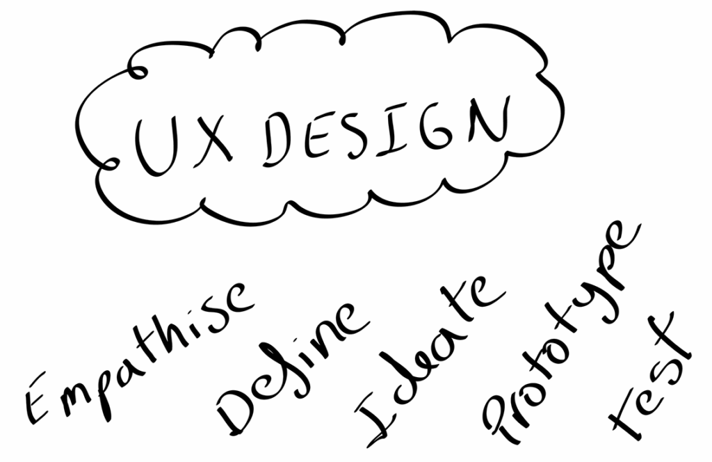
User experience design is essential to help understand the user’s behaviour. In addition, the user experience allows us to create products more accessible. According to Don Norman, in the article on the definition of user experience, the author highlight that the first requirement for an exemplary user experience is to meet the customer’s exact needs without fuss or bother. Therefore, the UX design process consists of five main steps: Empathise, Define, Ideate, Prototype, and Test. Each of these steps has different exercises that we will develop to integrate a positive user experience.

One bullet point was that UX is not designed for us. Instead, we are designed for the users, and first, we need to understand the problem we want to solve. So first, we must understand our customer’s needs in the small website project. One of the phrases highlighted during the meeting with the client was that We sell local products for local people. We need to accentuate that this bakery is located in a small town in England where the buyers are regular customers who have known the bakery for years.
Another critical point is that the owner requires targeting a new audience to be more open to young people. That’s why the website needs to reach more people and be more accessible and easy to use for older customers.
The answer is how we can reach the different goals and make things clear using research experience design.
One of the first steps in design thinking is to empathise. How can we do this? We need to put ourselves in the customer’s shoes. We can do this through interviews, surveys, group activities. This is the first step in our project. After figuring out customers needs, we define the problem. Then, we ideate an idea, prototype it, test it out, and collect all the feedback. Empathise and define.

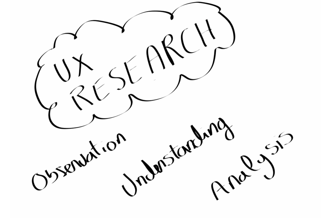
The first step to UX research is observation, understanding and analysis. In the image that we have beloved created by Christian Rohrer, he explains the different types of research, from resource-intensive usability lab studies to email surveys. The author divided by attitudinal and behavioural the difference between these two terms is what people say versus what people do. Therefore, we can define attitudinal research as understanding people’s beliefs. The article of MBA school explains Attitudinal Research is a user-experience research method used to realise a respondent’s opinions, beliefs, feelings or thoughts.
On the other hand, behavioural research understands what people do with a particular product or service. According to the user testing website, behavioural research will tell you what’s happening, while attitudinal research helps explain why it’s happening. Always keep in mind that what users say and what users do are often different.Qualitative methods are more suitable for answering questions about the why and the how-to-fix a problem, and quantitative research methods have a better performance in answering how many and how much. First, we need to understand the different methods of analysis we have in the UX research process.

Refining the goals for the website project will help clarify what we intend to achieve during this process and understand what the user needs are through research. Therefore, a questionnaire for setting research objectives was one of the exercises that helped refine the goals we wanted to develop. In addition, the questionnaire will allow us to navigate the different steps we need to go through to establish a good research process. The scenario we have is the information we have through the interviews with the client for the small website project. With the information we have and research, we can reply to these questions below.
Why are we doing this? What impact do we hope to achieve?
We are doing this to gain more visibility and impact our customers. One of the main aims is to discover if building a website will positively impact the bakery business. The users will easily navigate the website and reach new people through this system.
What do we want to learn?
We want to learn about our user’s needs and offer a solution for the users’ demands. For example, we can create a website to find the shop’s opening times and more information.
What do we think we know?
The information that we have before starting our UX research is the information that the owner of the shop gives to us at the beginning of the project.
They have local customers who are already going to shop for our fresh products every day. One of the main reasons for creating the website is to attract more people, a younger audience, and gain visibility in front of the competitive supermarkets. After the pandemic, many businesses started building websites to sell their services online. We know that creating a website for a small business will help reach more audiences and promote the service.
What do we think will happen?
The hypothesis is that building the website will help the business gain an audience, such as tourists visiting the small town. A younger audience who reach everything online, or maybe a more extensive business as an example a food catering that they can order our delicious cakes.
How will we know when it’s proven?
We will know when it is demonstrated an increase in our sales and the number of visits on our website if we gain more new customers than our loyal customers and have positive feedback from our loyal customers about the website.
Who is our target audience for this research?
The target audience for our research can be divided. For example, we want to attract younger people through the website while giving a. better services for our loyal customers to have direct access to our products and information.
What current research exists? E.g. analytics, market research, past insights.
This is the first time we are doing a website for the bakery business. The only information that we have are the sales of the store, perhaps we can research as a reference another small business that has a website, and we can study if the sales are higher or have any benefit.
Mike Kappel wrote an article about a small business strategy to increase sales. He explains the benefits of creating a website for a small business. He said that Traditional sales methods could help you generate sales. But don’t forget to take advantage of modern-day technology in your efforts. One of the most apparent benefits of having a small business website is that it enables people to find you online and quickly get in touch with you. The Internet helps you reach a more extensive customer base and communicate uniquely. He clarifies that you can build customer relationships by creating an easy-to-use website, presenting clear contact information, and providing excellent customer service.
According to the article written for Susan ward, 88.5% of people are internet users. All of this means that there are a whole lot of eyeballs that could be visiting and interacting with your small business’s website – if you had one. We know that having a website will improve people’s knowledge about the bakery business and reach a younger audience. We know that the new generation is more connected to sites and social media every day. Our challenge is getting them interested in the traditional bakery shop and catching their attention.

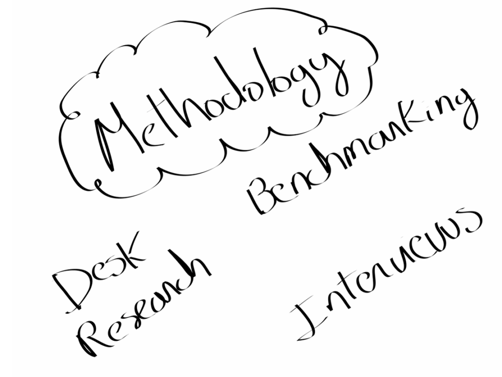
The research methods or methodology that I will use are desk research, competitive analysis and interviews. These are the methods I will use to conduct the bakery website project.
Desk research is a method with two areas: primary research and secondary research. Primary research is when you conduct the research yourself, for example, observation, surveys, interviews. Secondary research is the research that someone else has done before, for example, news articles, videos. The primary goal of the secondary research is to collect the data to understand the problem. What are we trying to solve?
In agreement with David Travis in the article for the website user focus, he explains that Desk research is not about collecting data. Instead, your role as a user researcher carrying out desk research is to review previous research findings to gain a broad understanding of the field.
- Small business on the website
- how to reach a younger audience
- How to save the planet with your bakery business
Aurelia Lambrecht’s explains in her blog that whenever someone is looking for something, they will Google the answer. Whenever someone comes across a new business, they will Google it for more information. If someone is looking for a baker in your area, you want someone to find you first when they Google it. We have clarified that the bakery needs a website, but we need to research how it is accessible and functional.
We know that our target audience can reach different generations, the website needs to be user friendly. The article written by Lexie Lu explains eight ways to make your website more user friendly. We can use these tricks to reach our goal of creating a user-friendly website.
- Listen to Your Users. The first trick is to listen to your regular customers on what their needs are missing from the bakery. For example, allergy guidance, opening timetables and more. If we want to reach a young audience, we can ask some local students how can we get that goal, maybe creating discounts on the website or easy recipes.
- Speed It Up. The bakery website is attached with many images about our seasonal products and can make the website very slow. One of the pieces of advice is to optimise the images to speed your site.
- Provide In-Depth Information. All the information about the bakery and the products should be easy to find. Otherwise, the users will get frustrated for not finding the information.
- Make Navigation Intuitive. The advice that Lexie Lu explains in the article is that the navigation bar is essential because it follows the site visitor throughout their journey on your site and serves as a tool to go back to the landing page.
- Choose Colour Carefully. Colour is fundamental for design to find the perfect balance for the traditional bakery business. The owner has a predominant colour that represents her brand. Dark red
- Improve Your Site Layout. About 80% of internet users own a smartphone, and they are spending more and more time accessing the Internet via their phones. That is why having a layout that can work on any device similar to laptops or tablets is necessary.
- Pay Attention to CTAs. In fact, for the bakery website, it should be a button highlighting the subscription to the news of the bakery or any subscription to weekly delivery. It is essential that the user can reach the button on the first layout of the page.
- Beef Up Your Contact Pag. The traditional bakery should have a contact page with the email and a phone number to be easy to reach from your customers via phone or WhatsApp.
All these ways are helpful for the site and the UI design of the website, but we are thinking at the same time about users. That is why I find it necessary to explain the different ways that can help us to create a user-friendly site.
We know that our loyal customers care about the environment. We do as well. That’s why in the traditional bakery, we are looking for solutions to reduce plastic one of the solutions that we will promote on the website is the use of ethical products. For example, our packing is 100% recyclable. That’s why we give a discount if you bring your bread bag. Reusing your packing when you shop is easy to reduce your environmental impact. One of the eco-friendly products that you can use is the Reusable Bread Bag, made from up to 10x recycled plastic drink bottles and designed to replace single-use paper or plastic bread bags, plastic toggles, and ties. According to an article written by Richard Gray, he explains that Coca-Cola, for example, produces 38,250 tonnes of plastic packaging in the UK each year, and estimates indicate it sells more than 110 billion single-use plastic bottles globally. So one of the bullets points for the site is to promote a way to reduce the plastic impact on the environment.
Following the article Benchmarking: A Tool for Sharing and Cooperation. Benchmarking is defined as the process of measuring products, services, and strategies against those of organisations known to be leaders in one or more aspects of their operations. In other words, benchmarking is the cation of research about other competitors websites to figure out what are they doing well and their marketing strategies.
After researching different websites about bakery companies and sustainability sites, I found three websites that are the inspiration for this project LOAF, Days bakery and Paul Rhodes bakery for the traditional bakery. The reasons for choosing this website are that there are easy to navigate through the site, the information is clear and easy to reach the contact details. As a user of these three websites, I can review them well. The experience of navigating the sites is user friendly and smooth.
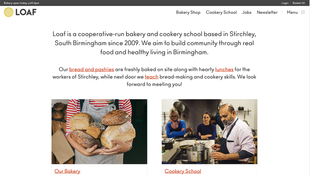
LOAF
On their website, you can access recipes, voucher discounts, and all the information about the bakery the last news. The website is simple but works very well with the business. All the data is gathered in a way that is easy to find. You can create an account with them and purchase your products.
Days Bakery
- https://daysbakery.com/our-food/
The Days Bakery is a brand of gourmet bakery. On their website, you can find different products with their prices displayed as a menu. The brand identity of the bakery is well demonstrated on their site with the correct typography and colours. The bakery’s story is easy to find about sustainability, contact, and location.
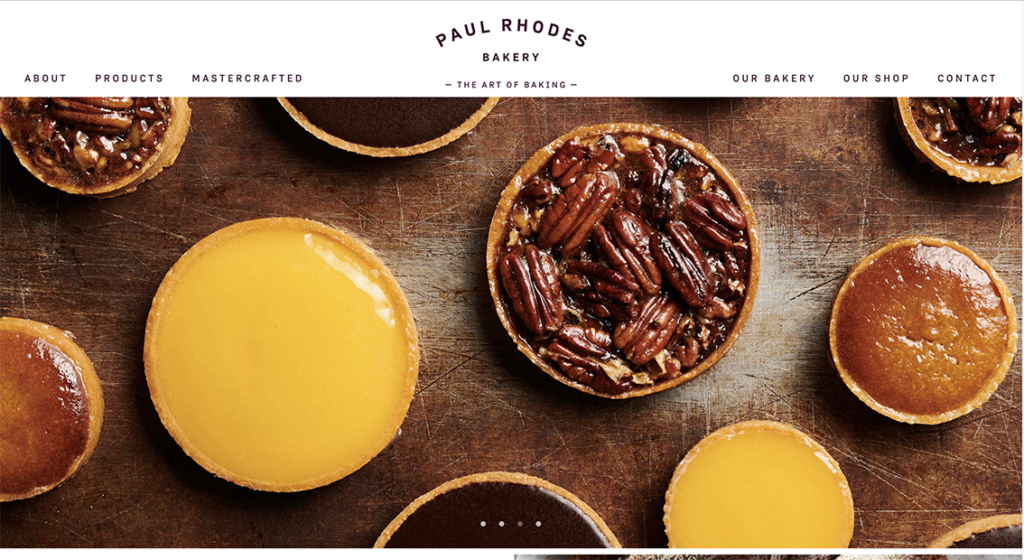
Paul Rhodes Bakery
- https://paulrhodesbakery.co.uk
The Paul Rhodes Bakery is a site designed to create an experience. The images on the front page make you buy their products straight away. All the information about the business is easy to find. They respect all the branding on their website. One of the things that I can highlight is that they show you the ingredients that their products are made. You cannot purchase any product online, but you can visit the store. The information about the location and the map is on the site.
The following steps are the interviews typically done one by one between the researcher and the user. In this case, it will be beneficial for the bakery business to ask one of the local customers around the area. With this exercise, we are looking to find what is working or what is not working for the user. We can classify interviews into three different types, Direct Interviews, non-direct interviews and contextual.
Because the bakery business is from a small place, the perfect interview will be the direct interview, one to one. In the workshop, they advise us that the best number to do a direct interview are five because, with five interviews, you can have most of the problems that you can find as a user experience. So we will interview five different people from different generations to cover the gap age. Because the interview is one to one, I would like to have open questions to see the different answers that I can have from the user and not give them to choose an option. If it is a survey for more people, I will put four options to choose between them.
The Interview Script
- How often do you go to a bakery store?
- What do you consider when purchasing bread, cakes or pastries?
- When was the last time you researched a small business on the Internet?
- The website of any small business can influence you to visit the place?
- Do you shop in places that care about the environment?
- Would you pay more for a better product or service?
- Do you use plastic bags in your daily shopping?
- Would you prefer fresh products or frozen products?
- Do you shop handmade products?
- Do you consult the allergies guidances of a business on their website?
- Do you read the reviews that are on the Internet about a company?
- Would you buy a cake in a bakery or the supermarket?
- Would you give as a present seasonal product, for example, Christmas cookies?
- Do you purchase food products online?

The next step in our UX research is defining the problem. In this step, we collect the data we have been researching during the process, and we create a good problem statement that should be human-centred. This is the main reason for creating personas to cover their needs.
Defining the problem
- How do we get more audience on the bakery website?
- How do we get our customers to cake about the environment?
- How can we attract more customers than the local supermarket?
To reply to the questions, the next step that we need to do is finish the interviews and create an affinity diagram with all the answers from our participants and the research that we have been gathering. After we had everything on the wall, we started grouping them as we did in the workshop. The most probable thing that will happen is finding a repetitive pattern. We will use one different colour for each person that we will interview.
Process techniques
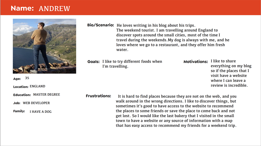
A persona is a standard tool used in UX design. Creating using profiles with different needs, understanding in which different scenarios our customers need our service, we created three profiles capturing the user needs to gain knowledge in other cases.
Based on our information about the bakery business in a small town in England, our target audience is local customers. Still, we can create diverse scenarios to create a better website for different people. Our three profiles are loyal customers who have been shopping for many years, a young adult living in a small town and the last one a tourist person who travels around England.
Why are we doing this exercise?
The main reason is capturing the user needs in different situations. Creating other profiles can help us understand how to make a website more accessible and cover the needs of our users. We can realise about doing this exercise that our needs can be different depending on each user.


Journey Mapping
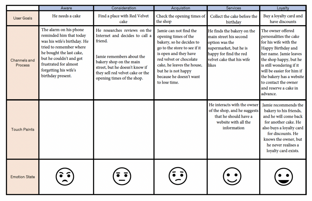
Sarah Gibbons defines A journey map as a visualisation of the process that a person goes through in order to accomplish a goal in the article Journey mapping 101. After creating the journey map, we will have a clear vision of how a user interacts with our product, in this case, the bakery website. We have different journey maps, but we will focus on the customer journey to see the interaction between the user and the product for this project. We will use the three personas we created before in this journey map.

Ideate and Prototype
You can use different techniques to develop your ideas, brainstorm, mind mapping, and more.Ideation is the third step in the design thinking process. We needed to define the problem when we had the meeting with the owner. He exposes his issues and how we can fix them through the website. The previous exercise that we did there developed the solutions for these issues.
The Bakery Business issues.
- Reach younger audience
- Be more environment friendly
- How can we reach more people to buy fresh products? Instead of going to the supermarket.
- Emphasises that we sell products for local people
Once we find the solutions for the problems, we need to start the website’s structure—this is a general idea, not a final proposal. Define navigation and create site maps. Once we have all the content for the website, we can create a navigation map of how the user will interact with the site. The idea is to break down how the website will work.
Define the content
- Recipes
- Food allergy
- Sustainability
- Preservation tips
- Profile Information
- Contact and services
- More
Group and label the content
My bakery
- Profile information
- Add products
- Contact form
- Work with us

User testing
Prototyping with pen and paper is the first step I will follow for the bakery website. After that, We can create a prototype of the information architecture in Adobe XD. Before starting the website is recommended, this exercise is organised and make clear site flows and site maps. Navigation is one of the keys to web design. Once the website prototype is created, it is time for the people to test it. It is essential to have feedback from the users to see if the site works. And if we solve the problem that we have at the beginning. The last step is to do the user test. We have three elements in the user test.
- Facilitator, in this case, we will guide the participant through the test process. We will show the user how the bakery website works. We will answer the questions that they have about the site.
- Participant, the user will run the website, and we will ask if he can think loudly about the site. The participant can narrate their action through the process. We can give them a different task to see how they interact with the website.
- Task, Using task, in this case, will be to find the allergy guidance for the chocolate croissant. We would write down their time to find the answer and ask them if it was difficult or easy.
For this website project, we will use the three elements to see which one is more suitable for creating a good user experience and obtaining the feedback we need from the users. First, it will be essential to use the empathy mapping we used during the workshop. This map will help us define the user experience.
Posted in UX | No Comments »
December 28th, 2021
After researching different websites about bakery companies and sustainability sites, I found three websites that are the inspiration for this project LOAF, Days bakery and Paul Rhodes bakery for the traditional bakery. The reasons for choosing this website are that there are easy to navigate through the site, the information is clear and easy to reach the contact details. As a user of these three websites, I can review them well. The experience of navigating the sites is user friendly and smooth.
LOAF
On their website, you can access recipes, voucher discounts, and all the information about the bakery the last news. The website is simple but works very well with the business. All the data is gathered in a way that is easy to find. You can create an account with them and purchase your products.
This company website is similar to what we want to create one of the things is that the overlook is a traditional and welcoming website like a website for small businesses in your local area. It is designed for local people, so you don’t have fancy images that look unrealistic. The photos are essential because you don’t want a sell an ideological product or a Pinterest image that is not what you sell. That is why I find this website an excellent example of what we should do for the small website project.

Days Bakery
- https://daysbakery.com/our-food/
The Days Bakery is a brand of gourmet bakery. On their website, you can find different products with their prices displayed as a menu. The brand identity of the bakery is well demonstrated on their site with the correct typography and colours. The bakery’s story is easy to find about sustainability, contact, and location.
This website is an excellent example of brand identity and how it is developed in all the small details from the typography, the colours and the logo and what the brand wants to transmit to the customer. On the other hand, this business is similar to a chain store that you can find in different locations. One f the things that we are missing is that it is not focused on local customers or small businesses is projected for a big company with different locations. We learn from this website the site’s identity and how we can integrate it into the Richardson bakery.

Paul Rhodes Bakery
- https://paulrhodesbakery.co.uk
The Paul Rhodes Bakery is a site designed to create an experience. The images on the front page make you buy their products straight away. All the information about the business is easy to find. They respect all the branding on their website. One of the things that I can highlight is that they show you the ingredients that their products are made. You cannot purchase any product online, but you can visit the store. The information about the location and the map is on the site.
I choose this site because of the navigation. And the navigation is the key for our small website project. It is simple and easy to find all the information, so it is an excellent example of a web design structure. The photographs want you to buy all the ingredients from the website and how they saturate the colours and highlight some points through photoshop to make them irresistible.

Posted in Richardson’s traditional bakery | No Comments »
