REVISTED SMALL BUSINESS WEBSITE
In this article, we will explore the process of revisiting the small business website with all the changes and improvements. During this journey, the gain of knowledge is considerable. Therefore, we will divide the steps.
- SEO features
- Mobile-first
- Javascript
- PHP
- UX features
- Accessibility features
- Review Change
SEO features
To improve the SEO of our site, we use metatags and microformats.
Meta tags help search engines interpret the content of a website. Consequently, it is essential to make them readable for search engines and potential customers.
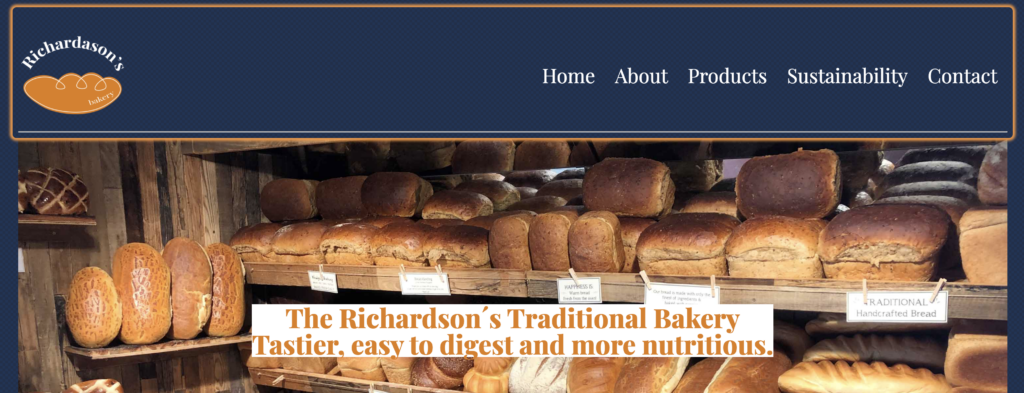
In the image below, we can see the use of different Meta tags that I applied to the HTML document. The use of h1 is essential to improve the SEO of the website. These improvement actions will be beneficial for the bakery website.
On the meta tags description, I expose the brand’s beliefs that is Richardson’s traditional bakery local products for local people and the three main words that describe the business Tastier, easy to digest and more nutritious. The main reason for doing this is because we want our customers to associate us with our brand values. Having strong branding is essential to having a better SEO. It Helps the website to have a unique touch and make a difference from other standards websites.

Another element to improve SEO is microformats. I used the h card; this microformat helped display your information in the search engines, for example, google. In this case, if someone is looking for a bakery around the area, the microformat will help us highlight our information and display our data on google search. This action is beneficial because we can attract more customers to our service. In this generation, we use the phone to research everything on the web. That’s why it is essential to improve our findability to reach a bigger audience

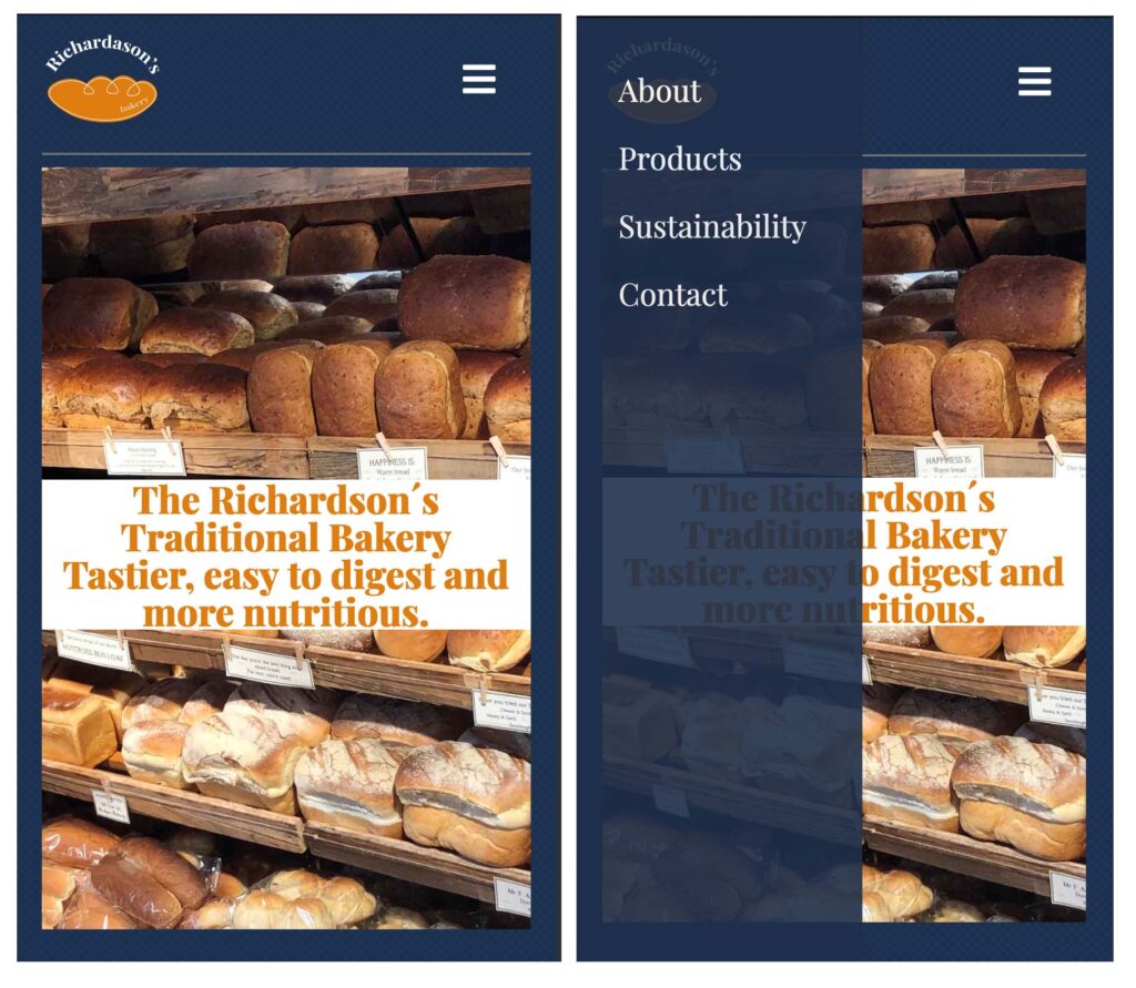
Mobile-first
In this project, we have the challenge of creating a new website version friendly to use with a mobile phone, which means that the website should be able to work on different screens sizes. To do this, we need to use the media queries to adapt our content in various sizes without squeezing the images or losing quality pixelation. At the same time, we need to work with the meta tag viewport to be able to see it on our screen.
I have to adapt each page for the revisited website because the content and the grid are different. However, we have common elements, for example, the footer and the navigation, that are the same on each page and subpage.
Javascript
One of the requirements for the revisited website was to include some basic javascript in our webpage. For this exercise, I decided to do phone navigation when the website’s screen is small in size. The main reason for doing this is because the user experience is essential for our webpage and business. If we have a functional navigation menu, it will be easy for our customers to reach the information they are looking for. Therefore the menu and the navigation increase in size with the functionality of seeing the display more extensive. Our target audience is local people from a small town in England. In this case scenario, the population of a small village are older adults. That is why the grid design is straightforward, and I prioritize seeing the elements clearly on the mobile size screen.
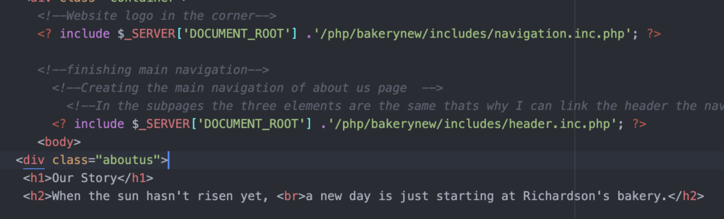
PHP
Learning PHP server-side includes is one of the subjects in web design that will help organise our content and modify any element. In this case, the website consists of the main page and four subpages. At the moment, the bakery website is a small site with low content, but in the future can be a more significant size with more data. If we tried to modify each page by page, it would take us a considerable amount of time.
PHP is a fast and clever way to organise your content without investing that much time. In HTML, we have elements in common in all our pages, for example, the header, the menu navigation and the footer. Therefore, in the revisited business website, the header is different on the main site than in the subpages, but the menu navigation and the footer are the same. Using PHP, I can have access to change or modify all the pages and subpages simultaneously.
Ux features
We included two elements to develop a better user experience in this project. One is the favicon icon, which is the website logo included inside the tab. For this icon, we worked on the size because it must be weight light for better performance on the web.
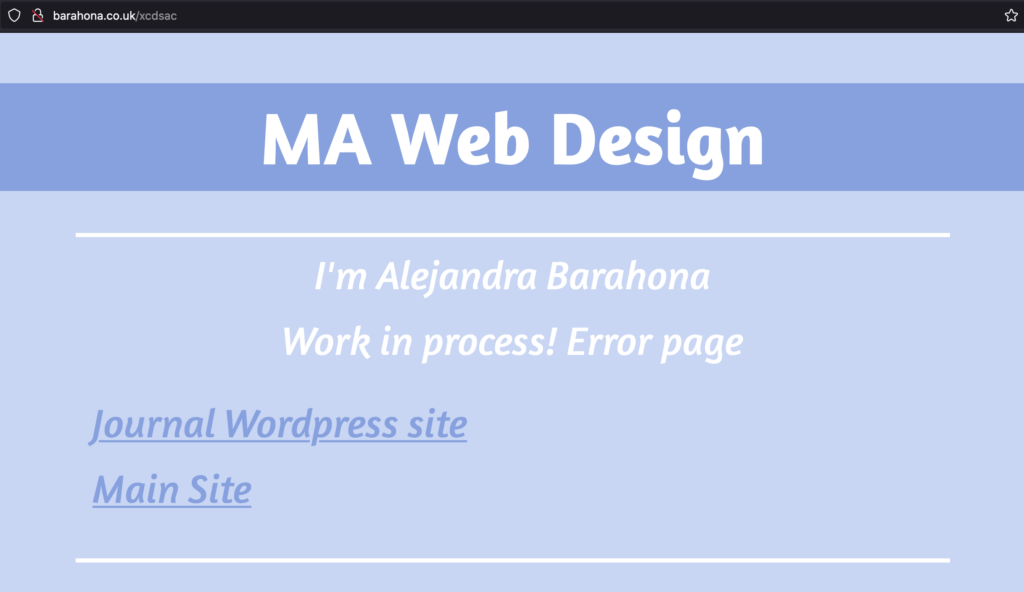
The other element is customised error pages. This improves the user experience because even if it is an error page, it connects with the visual design of the leading site. At the same time, we can add some links to help the user come back to the main page. We do this because we don’t want the user to get lost on the web and frustrated.
Accessibility features
There are different tools that people can use to read the screen, for example, the chrome reader extension. This app helps people with disabilities, blind or eyesight people, to be able to interact with the website.
For this project, we need to make the website visible to read, so we need to integrate different elements in our HTML for the user elements, such as landmark Roles. During this process, I discover that a good description of the images is beneficial for the user to visualize what they are hearing.
These small steps make it more significantly different for someone who has a disability to interact with the web. In my case, this is one of the hardest things to develop for the revisited website because I couldn’t be tried with someone with disabilities. Also, knowing if I was doing things right is complicated when you can not taste them properly.
Review Change
After reviewing the small business website, I make some changes to improve the project.
- Grids, on the previous website, I didn’t display a proper grid system to organise my content.
- The size of the images I change the size for a lightweight website will help optimise and improve the service, which means that the website will be faster.
- The use of figure elements for image/caption
- Make sure that I have a font stack for fallback.
- Don’t overuse the italic for big pieces of information because it is harder to read.
- Simplify my code and make it short and easy to read * I tried.
- Change the placement of the logo to be more suitable.
- Always check your code.
Conclusion
This project was a challenge, but I learned so much that I can see the massive difference between the websites. This project helped me develop a better understanding of the web and how things work and make me more curious about how can improve. These are baby steps in the process, but I am learning the different aspects of the web step by step.