November 16th, 2021
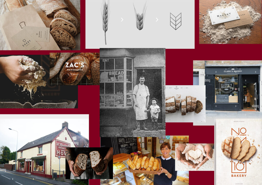
Richardson’s traditional bakery
After talking with the bakery owner, we concluded what he wants to transmit to his customers.
The bakery is the only bakery in town located on the main street. All our products are freshly made; we feel proud that they are handcrafted and good quality products. Our loyal customers highlight that we use ethical products and care about the environment, our packing is 100% recyclable, and we care about reducing packing waste. That’s why we give a discount if you bring your bread bag. Reusing your packing when you shop is an easy way to reduce your impact on the environment.
Quality doesn’t mean expensive for us. We sell local products for local people, with the difference on the taste, we don’t add additives to our products, the healthies option that you can find in the town, we feel proud that our products are cooked in our ovens every day at 4 am to be ready for our customers to try what a handmade bread tasted, we encourage the young people to try our products that’s why we offer a 10% discount for students, our doughnuts are famous on the town, we do seasonal products as well. Most of the people in town recognise our traditional logo in dark red and classic typography. We feel proud about it because it has been with us for decades. We are a traditional bakery, with local products for local people. We not only sell bread or cakes, but we also sell the experience of what handmade products is.
Posted in Richardson’s traditional bakery | No Comments »
November 12th, 2021

Grids are key elements in the design.
We use them for almost everything from a business card to building a website. Grid is the skeleton of our projects, helping in the creation, and because it is so important, I couldn’t help but talk about them.
Grid-based designs have been widely used in sectors such as graphic design, but they were slow to be adopted by the web. These designs consist of a series of columns that allow ordering and structuring the contents (text, images, media …) in an orderly and uniform way.
The importance of using a grid
Using a grid system allows you to design more efficiently simply by organizing the graphic elements of the piece, be it a website or a poster.
Grid is all good because:
- We can more easily determine the reading flow that we want our readers to have.
- It helps us design in harmonious proportions by balancing the weights of the graphic elements of the layout.
- It allows creating more practical pieces.
- Helps to position items more precisely. One of the biggest problems for my first web page is that I still don’t know how to create the grids in the code editor, and I am learning step by step.
Posted in Journal | No Comments »
November 11th, 2021

One of the things I have learned is white space; working on graphic design projects space is one of the most important things. Of course, in web design, it is too. But from my point of view, it is much more complicated because it must be handled through CSS.
Web design is about, among other things, knowing how to distribute the elements in the manoeuvring space of the web page correctly. It is essential to correctly handle negative or white space to achieve this and provide an excellent user experience that generates conversions.
Items must breathe and have enough space for interaction with other things. Here you will know, through several examples, how to use these spaces correctly and use them in your web design projects.
Posted in Journal | No Comments »
November 11th, 2021
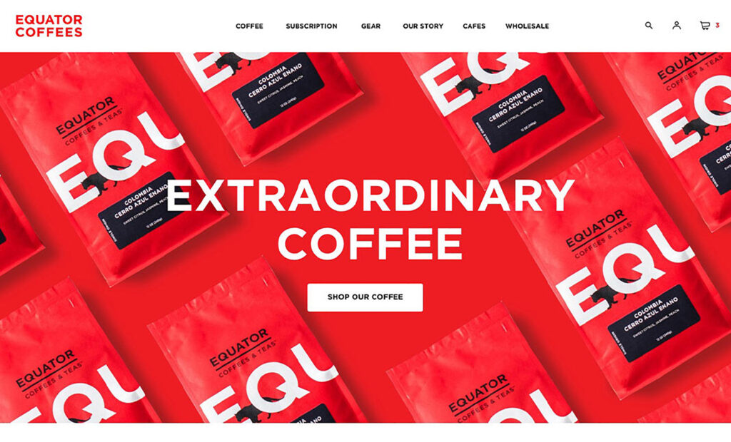
I am a coffee lover, and one of my favourite brands is the Equator. On their website, they have the slogan “Coffee can be better roasted, better prepared and, most importantly, it can be obtained in a way that improves life”, they explain the founders of this e-commerce, created in 1995. Its web design stands out for a successful combination of fonts and colours and the originality of the presentation of its products on the home page (below the initial slider) it is a simple parallax effect, but effective, accompanied by animations in the titles and other quality indicators, which do not weigh download times.
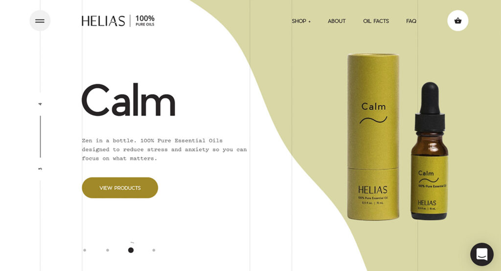
The Helias Oils company has one web page that has stood out for its most groundbreaking design in recent years. In this e-commerce, dedicated to the manufacture and sale of essential oils and homoeopathic remedies with 100% natural ingredients, we find (once again) the sequential structure, similar to some slides: a touch of scrolling is enough to navigate between its pages, designed with a background in white and pink, white and green, etc., with ripples similar to a liquid. Its minimalist aesthetic is surprising with the presence of transitions with a liquid effect between pages.
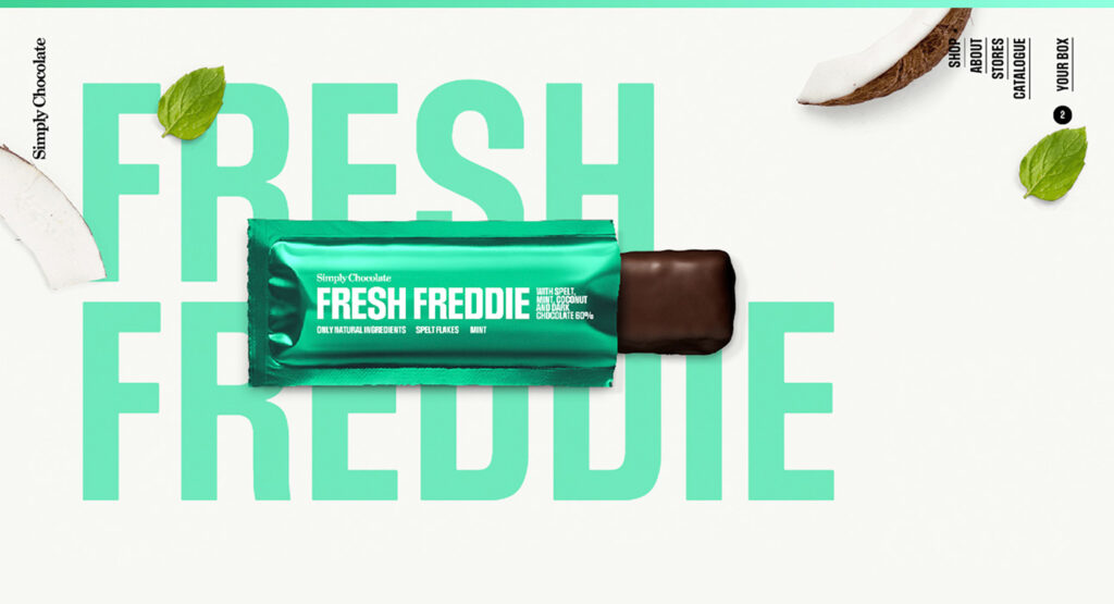
Simply Chocolate store boasts one of the best website designs. This Danish producer of chocolates makes his products by hand with natural ingredients, and his web space underlines that homemade ‘touch’ by showing his chocolates against backgrounds with leaves, sect fruits or fruit slices. Your web design can be defined as sequential (a touch of scrolling makes the vertical sections go through like slides), using the same background colors that correspond to your chocolate bars: brown, blue, green, etc.
Posted in Journal | No Comments »